What is the effectiveness of colour photography vs black and white photography?
|
Throughout my time as a photography student, I have discovered that I much prefer working in black and white, whilst I have done work in colour, generally my work is completely desaturated or only slightly - still holding the qualities a fully monochrome photograph hold. I have worked in both landscape and portrait, producing gritty and highly contrasted monochrome projects or highly detailed and vivid colour photographs. Throughout each of my projects I go through a similar process - the idea stage, the photographing stage, the editing stage and then the final stage, displaying them - I select the best photographs out of all my photoshoots and edit them all very closely and carefully to ensure that the colouring of them is just right as that, I would say, is the most important feature of photograph. They all go through different processes on Photoshop to give them a high contrast, to desaturate them, to sharpen them or make to the colours on the photograph more vibrant. Whilst I prefer working in black and white photography personally, I have discovered many photographers who create powerful photographs through colour photography.
|
|
Whilst in this process, I have discovered multiple photographers who have influenced and inspired the direction of my work due to the use of colours, tones and saturation. These photographers vary from portrait photographers such as Giacomo Favilla and Johannes Graf to landscape/cityscape photographers such as Eduard Gordeev. I have also discovered a photographer who works in an abstract style and his macro decaying photoshoot inspired me to work in macro and black and white – this photographer is Aaron Siskind.
Out of all of the photographers I have researched and worked from, I found that the most influential photographers I have studied are Aaron Siskind who works in black and white and Eduard Gordeev who works in colour. This is because of the high quality that is clearly shown across all of the work. Eduard Gordeev has created landscape photographs which look like oil paintings whilst Aaron Siskind works in an abstract way to create macro photographs both of these are two very distinct and opposite styles of working in. |
|
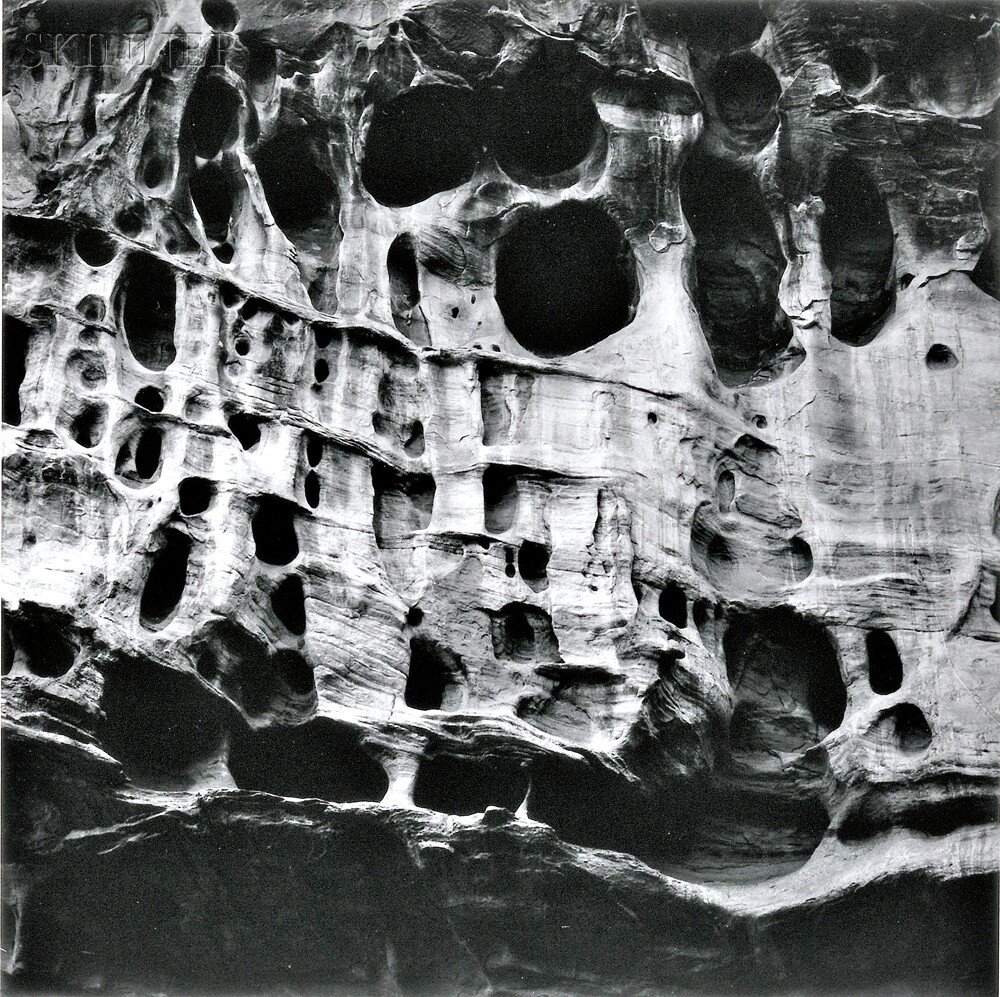
Aaron Siskind was born in 1901 and worked from the 1930's up until he died in 1993. He was part of the abstract expressionism which was a movement post World War II in American painting. ‘His work has been described as crossing the line between photography and painting.’ Whilst he was a part of a painting movement, he was a photographer who produced very compelling monochrome abstract and macro photographs. Generally macro photography consists of insects, flowers or other delicate things, however Aaron Siskind works in away of making his photography creating these wonderfully weird and contrasted photographs of decaying objects. Aaron Siskind's work is all done in monochrome, this makes the photograph more impressive as you are left to your imagination of the colours, therefore to what the original object was. The use of monochrome photography in today's life generally to create photographs that are timeless, therefore living on no matter what the time.
|
Monochrome photograph was only used for photography up until the invention colour photography which got introduced in 1861 but it is still heavily used to create photographs which are highly contrasted and timeless. Through the use of black and white photography, you are forced to focus on the object itself and not the colouring of the object and whether they work well. I find that this makes black and white photography effective because it is directing your focus unintentionally. Monochromatic photograph also allows the photographer to gain depth and structure through the grey scale and to be able to do this without over contrasting, darkening or making the image look flat is a skill that I believe every photographer should practice and be able to do, whilst they might not specialise in monochromatic photography, it is still a powerful way of taking photographs.
|
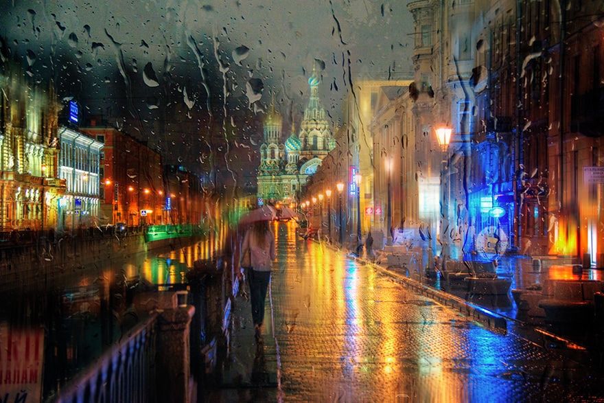
Whilst Eduard Gordeev works in a bizarre but beautiful way - he creates these beautiful oil painting look alike photographs which are done by taking a landscape or cityscape photograph through a rainy bus window. Eduard Gordeev is a Russia photographer that does the majority of work in the style of Oil Painting. The colours he works in are generally fairly subtle colours which add warmth to his rainy day photographs, however there is usually a subject that holds the focus by having a much more bolder colour showing through the rain drops. Eduard Gordeev’s photography is unusual and very unique.
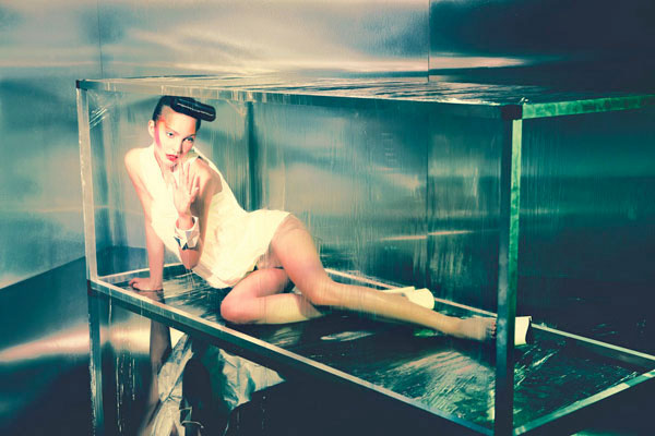
Many colour photographs are done in colour to either make a point about fashion, to show the natural colours in a landscape shot. Whilst monochromatic photography is very powerful itself, the idea that we can capture colour and have a still memory of something we have seen exactly how it was, when it was allows us to hold those memories for a lifetime. The importance of colour in photography is just as great as continuing to keep black and white photography going. Colour photography is important because it allows a photograph to tell a story by using colours but also it can hold many different emotions. Whilst using colours, a photograph will allow you to visualise the surrounds of that still shot by simply using a few colours or it will purposely hide the horrors that could be happening.
Many colour photographs are done in colour to either make a point about fashion, to show the natural colours in a landscape shot. Whilst monochromatic photography is very powerful itself, the idea that we can capture colour and have a still memory of something we have seen exactly how it was, when it was allows us to hold those memories for a lifetime. The importance of colour in photography is just as great as continuing to keep black and white photography going. Colour photography is important because it allows a photograph to tell a story by using colours but also it can hold many different emotions. Whilst using colours, a photograph will allow you to visualise the surrounds of that still shot by simply using a few colours or it will purposely hide the horrors that could be happening.
|
Warm colours will give the impression of warmth and happiness whilst cold colours will give it the impression of chills and potentially unhappiness, whilst this is a generalisation, many photographs break the ‘rules’ that are there but not set in stone. Both black and white and colour photography are used to create different atmospheres and are both very effective in their own ways. Whilst black and white photography becomes timeless and deep, colour photography can hide and show emotion. Black and white photography also can show emotion through people’s faces therefore conveys a different emotion by using a different technique.
There are many different styles of photography but you will always work in either colour or black and white and deciding what to work in whilst on a particular project can be difficult but once you finally decide can help lead on to your next project and deciding to work in colour or black and white before deciding the project. It is highly important as photographers to keep both the two different styles going on to ensure that the skill is still of a high standard and to keep the past available by shooting in black and white and too keep us imagining about the future by using colour photography. |
|
